Download
User Rating: 0/5 ( 0 votes)
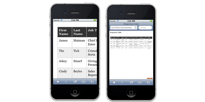
rt Responsive Tables is a jQuery plugin that takes tables utilizing "th" tags and makes them vertical at widths where the table would no longer be able to fit its container.
This plugin is built heavily upon the work by Chris Coyier found at http://css-tricks.com/responsive-data-tables/. The reason for this plugin, though, is that his method requires changing CSS breakpoints and the CSS that names the table columns in vertical mode. For static tables this is not a problem, but I needed something that would always work, no matter how the content in the table cells and headers might change. Instead of using hard-coded CSS for the column names, and breakpoints for when the table will no longer fit, this plugin is dynamic. It writes custom CSS into the head of the page, and calculates when to make the table vertical and when it can fit horizontally.
This plugin has been tested and works with modern versions of Chrome, Firefox, Safari, iOS, and Android. It works perfectly with IE9+ but older versions of IE won't show the vertical column names while in vertical mode (due to CSS limitations in IE8 and lower).
Source: github.com
1. INCLUDE CSS AND JS FILES
<link rel="stylesheet" href="jquery.rtResponsiveTables.min.css">
<script src="jquery.rtResponsiveTables.min.js" type="text/javascript"></script>
2. HTML
<table>
    <thead>
    <tr>
        <th>First Name</th>
        <th>Middle Name</th>
        <th>Last Name</th>
        <th>Occupation</th>
        <th>Date of Birth</th>
        <th>Favorite Food</th>
    </tr>
    </thead>
    <tbody>
    <tr>
        <td>Michael</td>
        <td>Gary</td>
        <td>Scott</td>
        <td>Regional Manager, Dunder Mifflin, Scranton</td>
        <td>March 15, 1964</td>
        <td>"Everything" Pretzels</td>
    </tr>
    <tr>
        <td>Dwight</td>
        <td>Kurt</td>
        <td>Schrute</td>
        <td>Assistant to the Regional Manager, Dunder Mifflin, Scranton PA</td>
        <td>January 20, 1968</td>
        <td>Beets</td>
    </tr>
    </tbody>
</table>
3. JAVASCRIPT
$("table").rtResponsiveTables();
4. OPTIONS
containerBreakPoint: number in pixels (default is 0)
There may be times when you want a table to become vertical even though it still technically can fit horizontally. The containerBreakPoint option allows you to give a number (in pixels) so that when the table's container hits that width, it will switch to vertical mode. If the table needs to switch before then, it will do so, but you can guarantee a table will at least switch by this number.
5. DATA ATTRIBUTE OPTIONS
data-rtContainerBreakPoint (number in pixels)
Much like the plugin option, containerBreakPoint, there may be times when you want a table to become vertical even though it still technically can fit horizontally. The data-rtContainerBreakPoint attribute allows you to give a number (in pixels) so that when the table's container hits that width, it will switch to vertical mode. If the table needs to switch before then, it will do so, but you can guarantee a table will at least switch by this number.
This option allows for you to do a one-off table so that you can set the plugin once with default options and then override individual tables with the data attribute.
Examples:
<table data-rtContainerBreakPoint="1000">
    <thead>
    <tr>
        <th>First Name</th>
        <th>Middle Name</th>
        <th>Last Name</th>
        <th>Occupation</th>
        <th>Date of Birth</th>
        <th>Favorite Food</th>
    </tr>
    </thead>
    <tbody>
    <tr>
        <td>Angela</td>
        <td>Noelle</td>
        <td>Martin</td>
        <td>Senior Accountant, Dunder Mifflin, Scranton</td>
        <td>Unknown</td>
        <td>Hairballs</td>
    </tr>
    <tr>
        <td>James</td>
        <td>Duncan</td>
        <td>Halpert</td>
        <td>Sales Representative, Dunder Mifflin, Scranton PA</td>
        <td>Unknown</td>
        <td>Tuna</td>
    </tr>
    </tbody>
</table>
 JS Tutorial


