Download
Demo
- Overview
- Documents
User Rating: 2.9/5 ( 2 votes)
Your Rating:
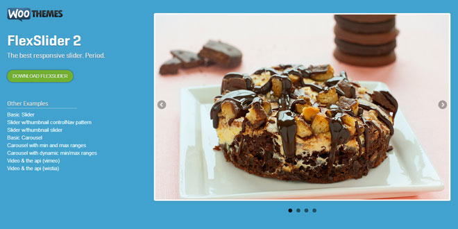
FlexSlider 2 is an awesome, fully responsive jQuery slider plugin with thumbnail controlNav pattern, thumbnail slider, carousel, carousel with min and max ranges, video in slide.
Source: flexslider.woothemes.com
1. INCLUDE CSS AND JS FILES
<link rel="stylesheet" href="css/flexslider.css" type="text/css" media="screen" />

<!-- jQuery -->
<script src="http://ajax.googleapis.com/ajax/libs/jquery/1/jquery.min.js"></script>

<!-- FlexSlider -->
<script defer src="js/jquery.flexslider.js"></script>
2. HTML
<!-- Place somewhere in the <body> of your page -->
<div class="flexslider">
  <ul class="slides">
    <li>
      <img src="slide1.jpg" />
    </li>
    <li>
      <img src="slide2.jpg" />
    </li>
    <li>
      <img src="slide3.jpg" />
    </li>
    <li>
      <img src="slide4.jpg" />
    </li>
  </ul>
</div>
3. JAVASCRIPT
// Can also be used with $(document).ready()
$(window).load(function() {
  $('.flexslider').flexslider({
    animation: "slide"
  });
});
4. OPTIONS
namespace: "flex-",             //{NEW} String: Prefix string attached to the class of every element generated by the plugin
selector: ".slides > li",       //{NEW} Selector: Must match a simple pattern. '{container} > {slide}' -- Ignore pattern at your own peril
animation: "fade",              //String: Select your animation type, "fade" or "slide"
easing: "swing",                //{NEW} String: Determines the easing method used in jQuery transitions. jQuery easing plugin is supported!
direction: "horizontal",        //String: Select the sliding direction, "horizontal" or "vertical"
reverse: false,                 //{NEW} Boolean: Reverse the animation direction
animationLoop: true,            //Boolean: Should the animation loop? If false, directionNav will received "disable" classes at either end
smoothHeight: false,            //{NEW} Boolean: Allow height of the slider to animate smoothly in horizontal mode
startAt: 0,                     //Integer: The slide that the slider should start on. Array notation (0 = first slide)
slideshow: true,                //Boolean: Animate slider automatically
slideshowSpeed: 7000,           //Integer: Set the speed of the slideshow cycling, in milliseconds
animationSpeed: 600,            //Integer: Set the speed of animations, in milliseconds
initDelay: 0,                   //{NEW} Integer: Set an initialization delay, in milliseconds
randomize: false,               //Boolean: Randomize slide order
thumbCaptions: false,           //Boolean: Whether or not to put captions on thumbnails when using the "thumbnails" controlNav.

// Usability features
pauseOnAction: true,            //Boolean: Pause the slideshow when interacting with control elements, highly recommended.
pauseOnHover: false,            //Boolean: Pause the slideshow when hovering over slider, then resume when no longer hovering
pauseInvisible: true,   		//{NEW} Boolean: Pause the slideshow when tab is invisible, resume when visible. Provides better UX, lower CPU usage.
useCSS: true,                   //{NEW} Boolean: Slider will use CSS3 transitions if available
touch: true,                    //{NEW} Boolean: Allow touch swipe navigation of the slider on touch-enabled devices
video: false,                   //{NEW} Boolean: If using video in the slider, will prevent CSS3 3D Transforms to avoid graphical glitches

// Primary Controls
controlNav: true,               //Boolean: Create navigation for paging control of each clide? Note: Leave true for manualControls usage
directionNav: true,             //Boolean: Create navigation for previous/next navigation? (true/false)
prevText: "Previous",           //String: Set the text for the "previous" directionNav item
nextText: "Next",               //String: Set the text for the "next" directionNav item

// Secondary Navigation
keyboard: true,                 //Boolean: Allow slider navigating via keyboard left/right keys
multipleKeyboard: false,        //{NEW} Boolean: Allow keyboard navigation to affect multiple sliders. Default behavior cuts out keyboard navigation with more than one slider present.
mousewheel: false,              //{UPDATED} Boolean: Requires jquery.mousewheel.js (https://github.com/brandonaaron/jquery-mousewheel) - Allows slider navigating via mousewheel
pausePlay: false,               //Boolean: Create pause/play dynamic element
pauseText: "Pause",             //String: Set the text for the "pause" pausePlay item
playText: "Play",               //String: Set the text for the "play" pausePlay item

// Special properties
controlsContainer: "",          //{UPDATED} jQuery Object/Selector: Declare which container the navigation elements should be appended too. Default container is the FlexSlider element. Example use would be $(".flexslider-container"). Property is ignored if given element is not found.
manualControls: "",             //{UPDATED} jQuery Object/Selector: Declare custom control navigation. Examples would be $(".flex-control-nav li") or "#tabs-nav li img", etc. The number of elements in your controlNav should match the number of slides/tabs.
sync: "",                       //{NEW} Selector: Mirror the actions performed on this slider with another slider. Use with care.
asNavFor: "",                   //{NEW} Selector: Internal property exposed for turning the slider into a thumbnail navigation for another slider

// Carousel Options
itemWidth: 0,                   //{NEW} Integer: Box-model width of individual carousel items, including horizontal borders and padding.
itemMargin: 0,                  //{NEW} Integer: Margin between carousel items.
minItems: 1,                    //{NEW} Integer: Minimum number of carousel items that should be visible. Items will resize fluidly when below this.
maxItems: 0,                    //{NEW} Integer: Maxmimum number of carousel items that should be visible. Items will resize fluidly when above this limit.
move: 0,                        //{NEW} Integer: Number of carousel items that should move on animation. If 0, slider will move all visible items.
allowOneSlide: true,           //{NEW} Boolean: Whether or not to allow a slider comprised of a single slide

// Callback API
start: function(){},            //Callback: function(slider) - Fires when the slider loads the first slide
before: function(){},           //Callback: function(slider) - Fires asynchronously with each slider animation
after: function(){},            //Callback: function(slider) - Fires after each slider animation completes
end: function(){},              //Callback: function(slider) - Fires when the slider reaches the last slide (asynchronous)
added: function(){},            //{NEW} Callback: function(slider) - Fires after a slide is added
removed: function(){},           //{NEW} Callback: function(slider) - Fires after a slide is removed
init: function() {}             //{NEW} Callback: function(slider) - Fires after the slider is initially setup
5. METHODS
- $('#slider').flexslider("play")  //Play slideshow
- $('#slider').flexslider("pause") //Pause slideshow
- $('#slider').flexslider("stop") //Stop slideshow
- $('#slider').flexslider("next")  //Go to next slide
- $('#slider').flexslider("prev")  //Go to previous slide
- $('#slider').flexslider(3)       //Go fourth slide
- slider.addSlide(obj, pos) accepts two parameters, a string/jQuery object and an index.
- slider.removeSlide(obj) accepts one parameter, either an object to be removed, or an index.
6. EXAMPLES
Thumbnail ControlNav Pattern
HTML
<!-- Place somewhere in the <body> of your page -->
<div class="flexslider">
  <ul class="slides">
    <li data-thumb="slide1-thumb.jpg">
      <img src="slide1.jpg" />
    </li>
    <li data-thumb="slide2-thumb.jpg">
      <img src="slide2.jpg" />
    </li>
    <li data-thumb="slide3-thumb.jpg">
      <img src="slide3.jpg" />
    </li>
    <li data-thumb="slide4-thumb.jpg">
      <img src="slide4.jpg" />
    </li>
  </ul>
</div>
JAVASCRIPT
// Can also be used with $(document).ready()
$(window).load(function() {
  $('.flexslider').flexslider({
    animation: "slide",
    controlNav: "thumbnails"
  });
});
Basic Carousel
HTML
<!-- Place somewhere in the <body> of your page -->
<div class="flexslider">
  <ul class="slides">
    <li>
      <img src="slide1.jpg" />
    </li>
    <li>
      <img src="slide2.jpg" />
    </li>
    <li>
      <img src="slide3.jpg" />
    </li>
    <li>
      <img src="slide4.jpg" />
    </li>
    <!-- items mirrored twice, total of 12 -->
  </ul>
</div>
JAVASCRIPT
$(window).load(function() {
  $('.flexslider').flexslider({
    animation: "slide",
    animationLoop: false,
    itemWidth: 210,
    itemMargin: 5
  });
});
 JS Tutorial


