Download
User Rating: 4/5 ( 1 votes)
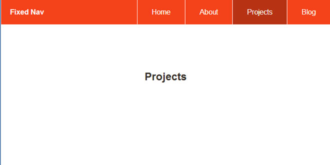
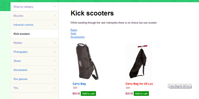
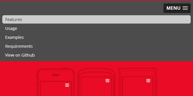
Fixed Responsive Nav - Responsive, fixed and touch friendly one page navigation, using Responsive Nav, smooth animated scrolling & vanilla JavaScript.
Fixed Nav Features
-
Fixed positioned, always visible navigation bar
-
Uses vanilla JavaScript, no jQuery required
-
Smooth animated scrolling
-
Removes 300ms tap delay
-
Adds a mask over the content when navigation is open
-
Auto highlights current location when scrolling the site
-
Uses a tiny custom font for icons (only two characters included)
-
Closes the navigation when user tap’s outside of it
-
Tapping a link changes the URL, so users can still copy/paste it from the address bar and link to different sections
-
Built progressive enhancement in mind
-
Tested to be working in IE6 and up
Source: adtile.me
1. INCLUDE JS FILES
<script src="js/fixed-responsive-nav.js"></script>
2. HTML
Add a class 'nav-collapse' to html mackup
<header>
<nav class="nav-collapse">
<ul>
<li class="active"><a href="#home" data-scroll>Home</a></li>
<li><a href="#about" data-scroll>About</a></li>
<li><a href="#projects" data-scroll>Projects</a></li>
<li><a href="#blog" data-scroll>Blog</a></li>
</ul>
</nav>
</header>
<section id="home">
<h1>Fixed Nav</h1>
<p>The code and examples are hosted on GitHub and can be <a href="https://github.com/adtile/fixed-nav">found from here</a>. Read more about the approach from <a href="http://blog.adtile.me/2014/03/03/responsive-fixed-one-page-navigation/">our blog</a>.</p>
</section>
<section id="about">
<h1>About</h1>
</section>
<section id="projects">
<h1>Projects</h1>
</section>
<section id="blog">
<h1>Blog</h1>
</section>
 JS Tutorial


