- Overview
- Documents
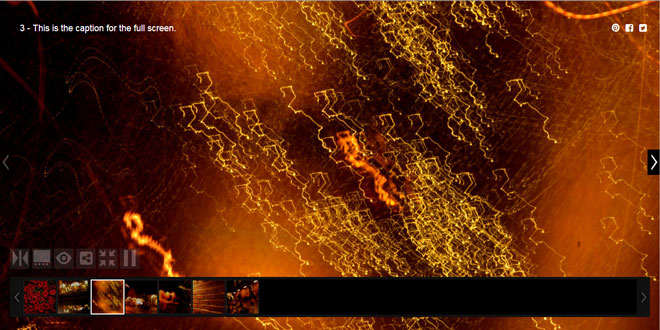
ezContentSlider is a full-featured slider / fader with a carousel for thumbnails (or smaller), as well as a full-screen mode for when you want maximum visual impact.
Key Benefits & Features:
-
Extrememly Social
Share to Social can be defined at the image (not just page) level. -
Flexible and Robust
Nearly everything is an option you can define / change. -
You're in Control
The markup is yours, the plugin just manipulates it for you. This approach also cuts down on the overhead associated with mucking with the DOM and such. -
Clean & Easy To Follow
If you feel you must, just fork it and make it your own. You're welcome.
Source: ezcontentslider.com
1. INCLUDE CSS AND JS FILES
<link href="http://netdna.bootstrapcdn.com/bootstrap/3.2.0/css/bootstrap.min.css" rel="stylesheet">
<!-- Custom styles for this template -->
<link href="css/ezcontent-slider.css?v=320.0" rel="stylesheet">
<!-- This is the CSS that is specific to the plugin -->
<link href="css/ezcontent-slider-js.css?v=320.0" rel="stylesheet">
<script src="http://ajax.googleapis.com/ajax/libs/jquery/1.8.2/jquery.min.js"></script>
<script src="http://netdna.bootstrapcdn.com/bootstrap/3.2.0/js/bootstrap.min.js"></script>
<script src="js/jquery.ezContentSlider.min.js?v=058"></script>
2. HTML
<div id="demo" class="ezcs-content-slider">
	<!-- Main wrapper  -->
	<div class="ezcs-main-wrapper">
	  <span class="ezcs-main-prev" title="Previous Image"></span>
	  <span class="ezcs-main-next" title="Next Image"></span>
	  <div class="ezcs-main-slides">
	  <ul>
	  <li>
	  <span class="ezcs-caption-reg ezcs-display-reg">1 - This is the caption for the regular sized image.</span>
	  <span class="ezcs-caption-full ezcs-display-full">1 - The caption for the full screen can be different.</span>
	  <span class="ezcs-share-reg ezcs-display-reg"><i class="fa fa-pinterest fa-fw"></i> <i class="fa fa-facebook-square fa-fw"></i> <i class="fa fa-<a href="http://www.jqueryscript.net/tags.php?/twitter/">twitter</a>-square fa-fw"></i></span>
	  <span class="ezcs-share-full ezcs-display-full"><i class="fa fa-pinterest fa-fw"></i> <i class="fa fa-facebook-square fa-fw"></i> <i class="fa fa-twitter-square fa-fw"></i></span>
	  <a href="#" class="ezcs-the-slides">
		<img class="ezcs-display-reg" src="1.jpg" title="Reg - One"  alt="Reg - One" />
		<img class="ezcs-display-full" src="1-lrg.jpg" title="Large - One"  alt="Large - One" />
	  </a>
	  </li>
	  <li>
	  <span class="ezcs-caption-reg ezcs-display-reg">2 - Captions can contain a links.</span>
	  <span class="ezcs-caption-full ezcs-display-full">2 - This is the caption for full screen.</span>
	  <span class="ezcs-share-reg ezcs-display-reg"><i class="fa fa-pinterest fa-fw"></i> <i class="fa fa-facebook-square fa-fw"></i> <i class="fa fa-twitter-square fa-fw"></i></span>
	  <span class="ezcs-share-full ezcs-display-full"><i class="fa fa-pinterest fa-fw"></i> <i class="fa fa-facebook-square fa-fw"></i> <i class="fa fa-twitter-square fa-fw"></i></span>
	  <a href="#" class="ezcs-the-slides">
		<img class="ezcs-display-reg" src="2.jpg" title="Reg - Two"  alt="Reg - Two" />
		<img class="ezcs-display-full" src="2-lrg.jpg" title="Large - Two"  alt="Large - Two" />
	  </a>
	  </li>
	  <li>
	  <span class="ezcs-caption-reg ezcs-display-reg">3 - This is the caption for the regular sized image.</span>
	  <span class="ezcs-caption-full ezcs-display-full">3 - This is the caption for the full screen.</span>
	  <span class="ezcs-share-reg ezcs-display-reg"><i class="fa fa-pinterest fa-fw"></i> <i class="fa fa-facebook-square fa-fw"></i> <i class="fa fa-twitter-square fa-fw"></i></span>
	  <span class="ezcs-share-full ezcs-display-full"><i class="fa fa-pinterest fa-fw"></i> <i class="fa fa-facebook-square fa-fw"></i> <i class="fa fa-twitter-square fa-fw"></i></span>
	  <a href="#" class="ezcs-the-slides">
		<img class="ezcs-display-reg" src="3.jpg" title="Reg - Three" alt="Reg - Three"  />
		<img class="ezcs-display-full" src="3-lrg.jpg" title="Large - Three" alt="Large - Three"  />
	  </a>
	  </li>
	  <li>
	  <span class="ezcs-caption-reg ezcs-display-reg">4 - This is the caption for the regular sized image.</span>
	  <span class="ezcs-caption-full ezcs-display-full">4 - This is the caption for the full screen.</span>
	  <span class="ezcs-share-reg ezcs-display-reg"><i class="fa fa-pinterest fa-fw"></i> <i class="fa fa-facebook-square fa-fw"></i> <i class="fa fa-twitter-square fa-fw"></i></span>
	  <span class="ezcs-share-full ezcs-display-full"><i class="fa fa-pinterest fa-fw"></i> <i class="fa fa-facebook-square fa-fw"></i> <i class="fa fa-twitter-square fa-fw"></i></span>
	  <a href="#" class="ezcs-the-slides">
		<img class="ezcs-display-reg" src="4.jpg"  alt="Reg - Four" title="Reg - Four" />
		<img class="ezcs-display-full" src="4-lrg.jpg" alt="Large - Four" title="Large - Four" />
	  </a>
	  </li>
	  <li>
	  <span class="ezcs-caption-reg ezcs-display-reg">5 - This is the caption for the regular sized image.</span>
	  <span class="ezcs-caption-full ezcs-display-full">5 - This is the caption for the full screen.</span>
	  <span class="ezcs-share-reg ezcs-display-reg"><i class="fa fa-pinterest fa-fw"></i> <i class="fa fa-facebook-square fa-fw"></i> <i class="fa fa-twitter-square fa-fw"></i></span>
	  <span class="ezcs-share-full ezcs-display-full"><i class="fa fa-pinterest fa-fw"></i> <i class="fa fa-facebook-square fa-fw"></i> <i class="fa fa-twitter-square fa-fw"></i></span>
	  <a href="#" class="ezcs-the-slides">
		<img class="ezcs-display-reg" src="5.jpg"  alt="Reg - Five" title="Reg - Five" />
		<img class="ezcs-display-full" src="5-lrg.jpg" alt="Large - Five" title="Large - Five" />
	  </a>
	  </li>
	  <li>
	  <span class="ezcs-caption-reg ezcs-display-reg">6 - This is the caption for the regular sized image.</span>
	  <span class="ezcs-caption-full ezcs-display-full">6 - This is the caption for the full screen.</span>
	  <span class="ezcs-share-reg ezcs-display-reg"><i class="fa fa-pinterest fa-fw"></i> <i class="fa fa-facebook-square fa-fw"></i> <i class="fa fa-twitter-square fa-fw"></i></span>
	  <span class="ezcs-share-full ezcs-display-full"><i class="fa fa-pinterest fa-fw"></i> <i class="fa fa-facebook-square fa-fw"></i> <i class="fa fa-twitter-square fa-fw"></i></span>
	  <a href="#" class="ezcs-the-slides">
		<img class="ezcs-display-reg" src="6.jpg"  alt="Reg - Six" title="Reg - Six" />
		<img class="ezcs-display-full" src="6-lrg.jpg"  alt="Full - Six" title="Full - Six" />
	  </a>
	  </li>
	  <li>
	  <span class="ezcs-caption-reg ezcs-display-reg">7 - This is the caption for the regular sized image.</span>
	  <span class="ezcs-caption-full ezcs-display-full">7 - This is the caption for the full screen.</span>
	  <span class="ezcs-share-reg ezcs-display-reg"><i class="fa fa-pinterest fa-fw"></i> <i class="fa fa-facebook-square fa-fw"></i> <i class="fa fa-twitter-square fa-fw"></i></span>
	  <span class="ezcs-share-full ezcs-display-full"><i class="fa fa-pinterest fa-fw"></i> <i class="fa fa-facebook-square fa-fw"></i> <i class="fa fa-twitter-square fa-fw"></i></span>
	  <a href="#" class="ezcs-the-slides">
		<img class="ezcs-display-reg" src="7.jpg"  alt="Reg - Seven" title="Reg - Seven" />
		<img class="ezcs-display-full" src="7-lrg.jpg"  alt="Full - Seven" title="Full - Seven" />
	  </a>
	  </li>
	  </ul>
	</div>

	<!-- Image loader  -->
	<div class="ezcs-loader"></div>
	<div class="ezcs-clear"></div>

	<!-- Controls  -->
	<div class="ezcs-controls-wrapper">
	  <span id="ezcs-control-switch-show" class="ezcs-control-switch" title="Hide controls"></span>
	  <span id="ezcs-control-switch-hide" class="ezcs-control-switch" title="Show controls" style="display:none"></span>
	  <div class="ezcs-controls-switch-wrapper"> <!-- these elements will toggle as a group when the switch control is clicked -->
	  <span id="ezcs-control-thumbs-show" class="ezcs-control-thumbs" title="Hide thumbnail carousel"></span>
	  <span id="ezcs-control-thumbs-hide" class=" ezcs-control-thumbs" title="Show thumbnail carousel"  style="display:none"></span>
	  <span id="ezcs-control-caption-show" class="ezcs-control-caption" title="Hide captions"></span>
	  <span id="ezcs-control-caption-hide" class="ezcs-control-caption" title="Show captions" style="display:none"></span>
	  <span id="ezcs-control-share-show" class="ezcs-control-share" title="Hide share options"></span>
	  <span id="ezcs-control-share-hide" class="ezcs-control-share" title="Show share options" style="display:none"></span>
	  <span id="ezcs-control-display-full" class="ezcs-control-display" title="Return to Normal" style="display:none"></span>
	  <span id="ezcs-control-display-small" class="ezcs-control-display" title="Expand to fullscreen"></span>
	  <span id="ezcs-control-play-play" class="ezcs-control-play" title="Pause" style="display:none"></span>
	  <span id="ezcs-control-play-pause" class="ezcs-control-play" title="Play"></span>
	  </div>
	</div>
	</div>

	<!-- <a href="http://www.jqueryscript.net/tags.php?/Thumbnail/">Thumbnail</a> carousel  -->
	<div class="ezcs-carousel-wrapper">
	  <span class="ezcs-carousel-group-prev" title="Previous page"></span>
	  <span class="ezcs-carousel-group-next" title="Next page"></span>
	  <div class="ezcs-carousel-pages-wrapper">
	  <ul class="ezcs-paging-list">
		<li><img src="1-thumb.jpg" alt="ezWebDevTools - ezContentSlider - FunPixPlus - Img 1 thumb" /></li>
		<li><img src="2-thumb.jpg" alt="ezWebDevTools - ezContentSlider - FunPixPlus - Img 2 thumb" /></li>
		<li><img src="3-thumb.jpg" alt="ezWebDevTools - ezContentSlider - FunPixPlus - Img 3 thumb" /></li>
		<li><img src="4-thumb.jpg" alt="ezWebDevTools - ezContentSlider - FunPixPlus - Img 4 thumb" /></li>
		<li><img src="5-thumb.jpg" alt="ezWebDevTools - ezContentSlider - FunPixPlus - Img 5 thumb" /></li>
		<li><img src="6-thumb.jpg" alt="ezWebDevTools - ezContentSlider - FunPixPlus - Img 6 thumb" /></li>
		<li><img src="7-thumb.jpg" alt="ezWebDevTools - ezContentSlider - FunPixPlus - Img 7 thumb" /></li>
	  </ul>
	  </div>
	</div>
</div>
3. JAVASCRIPT
$(document).ready(function() {
	$('#demo').ezContentSlider(;
});
4. OPTIONS
-
startIndex : 0
Integer - What slide should we start with.Note: The index of the first slide is 0 not 1.
-
loaderSelector : '.ezcs-loader'
String - Selector (class) of the div that holds the spinner / loading .gif.Note: If you don't like the one provided, feel free to do your own.
-
controlsSwitchWrapperClass : '.ezcs-controls-switch-wrapper'
String - Selector (class) of div that wraps all the control bar's icons (except the switch control). This div is toggled by the switch click. -
controlsSwitchFadeDuration : 200
Integer - Fancy a fade on the switch toggle. This is the value for the duration. -
controlsSwitchClass : '.ezcs-control-switch',
String - Selector (class) of the control bar's switch. -
controlsThumbsClass : '.ezcs-control-thumbs'
String - Selector (class) of the control bar's thumbs (i.e., show() / hide() carousel). -
controlsCaptionClass : '.ezcs-control-caption'
String -Selector (class) of the control bar's caption (i.e., show() / hide() caption). -
controlsShareClass : '.ezcs-control-share'
String - Selector (class) of the control bar's share (i.e., show() / hide() share icons). -
controlsDisplayClass : '.ezcs-control-display'
String - Selector (class) of the control bar's display (i.e., full-screen toggle). -
controlsPlayClass : '.ezcs-control-play'
String - Selector (class) of the control bar's play (i.e., play / pause). -
carouselUse : true
Bool - On init, setup the carousel. true, else any other value will be considered false.Note: You must be explicit about wanting the carousel. The plugin tends not to assume anything.
-
carouselPageSelectedClassName : 'ezcs-selected'
String - Name of the class used to identify the current carousel slide.Note: This setting is simply the class name, the leading period (.) should not be included.
-
carouselWrapperSelector : '.ezcs-carousel-wrapper'
String - Selector (class) of the div that wraps the whole carousel. -
carouselPagesWrapperSelector : '.ezcs-carousel-pages-wrapper'
String - Selector (class) of the div that wraps the thumbnails within the carousel. -
carouselGroupNextSelector : '.ezcs-carousel-group-next'
String - Selector (class) of the div for paging to the next group of thumbnails. -
carouselGroupPrevSelector : '.ezcs-carousel-group-prev'
String - Selector (class) of the div for paging to the previous group of thumbnails. -
carouselGroupPageOverlap : 0
Integer - How many thumbnails (aka pages) from the current group being displayed will be "overlapped" into the next / prev group to be diaplayed.Note: The intention of overlapping is to make it easier for users to follow the group paging.
-
carouselGroupPagingEffect : 'slide'
String - Or 'fade'. Any value other than 'fade' will default to 'slide'. -
carouselGroupPagingDuration : 250
Integer - The duration of the .fadeOut() / .fadeIn() when paging from one group to the next. -
carouselSlideEasing : 'swing'
String - If carouselGroupPagingEffect : 'slide' then use this easing value (else this value gets ignored). Use 'swing' else any other value defaults to 'linear'. -
carouselPageWidthInt : 68
Integer - To save a bit of effort / overhead, the plugin doesn't calculate the width of the thumbnail. You need to set the total (of img width + borders + margins + paddings) here.Note: Just the integer (without the px).
-
carouselPageClickStopsPlayAuto : true
Bool - A click on any thumbnail (aka page) in the carousel will stop the auto-play. -
mainNextSelector : '.ezcs-main-next'
String - Selector (class) of the div (positioned over the main slide) for moving to the next slide. -
mainPrevSelector : '.ezcs-main-prev'
String - Selector (class) of the div (positioned over the main slide) for moving to the previous slide. -
mainNextPrevClickStopsPlayAuto : true
Bool - A click on the main next / main prev will stop the auto-play. -
mainFullImgRatioDataAttr : 'ezscfullimgratio'
String - Used to create a data attribute used by the plugin.Note: 'data-' will be prefixed to this string to create a data attr.
-
mainFullImgWidthDataAttr : 'ezscfullimgwidth'
String - Used to create a data attribute used by the plugin.Note: 'data-' will be prefixed to this string to create a data attr.
-
mainFullImgHeightDataAttr : 'ezscfullimgheight'
String - Used to create a data attribute used by the plugin.Note: 'data-' will be prefixed to this string to create a data attr.
-
mainFullImgSrcDataAttr : 'ezscfullimgsrc'
String - Used to create a data attribute used by the plugin.Note: 'data-' will be prefixed to this string to create a data attr.
-
mainFullImgLazyLoad : true
Bool - When set to true the plugin will do the following when toggling to full-screen: Initially use the normal image, stretch it to full-screen; then "lazy load" the full-screen image; once that's loaded replace the normal sized image with the full-screen image.Note: Using false could have a nasty negative impact on page size / load time.
-
slidesMainSelector : '.ezcs-main-slides'
String - Selector (class) of the div that wraps just the images within a given (single) slide.Note: Use is TBD. That is, the plugin does not use this option at the moment.
-
slidesMainEffect : 'slide'
String - Also 'fade', else any other value defaults to 'slide'.Note: slidesMainEffect does not necessarily have to match the carousel.
-
slidesMainFadeOutDuration : 300
Integer - If slidesMainEffect : 'fade' then this is the duration of the fadeOut(). -
slidesMainFadeInDuration : 300
Integer - If slidesMainEffect : 'fade' then this is the duration of the fadeIn(). -
slidesPerSlideDuration : 200
Integer - If slidesMainEffect : 'slide', what "speed" is the slide transition.Note: This value should not be greater than playAutoDuration, and as such there's no code to check this. It's on you.
-
slidesPerSlideEasing : 'swing'
String - If slidesMainEffect : 'slide' then use this easing value. Use 'swing' else any other value defaults to 'linear'. -
captionRegClass : '.ezcs-caption-reg'
String - Selector (class) of the span (or div, if you want) that wraps the caption for the regular (i.e., non full-screen) sized slide. -
captionFullClass : '.ezcs-caption-full'
String - Selector (class) of the span (or div, if you want) that wraps the caption for the full-screen sized slide. -
captionIsShow : true
Bool - Are we going to use the captions.Note: If false then it's up to you to sort out the markup. That is, remove the tool bar control or flip-flop the display:none.
-
shareRegClass : '.ezcs-share-reg'
String - Selector (class) of the span (or div, if you want) that wraps the share icons / links for the regular (i.e., non full-screen) sized slide. -
shareFullClass : '.ezcs-share-full'
String - Selector (class) of the span (or div, if you want) that wraps the share icons / links for the full-screen sized slide. -
shareIsShow : true
Bool - Are we going to use share.Note: If false then it's up to you to sort out the markup. That is, remove the tool bar control or flip-flop the display:none.
-
displayRegClass : '.ezcs-display-reg'
String - Selector (class) for the regular (i.e., non full-screen) elements. It's used when toggling between regular and full. -
displayFullClass : '.ezcs-display-full'
String - Selector (class) for the regular (i.e., non full-screen) elements. It's used when toggling between regular and full. -
displayFullCloseWithEscape : true
Bool - When in full-screen hitting the escape key will close the full-screen and toggel back to regular. -
displayFullStyle : 'fill'
String - How should the full-screen image be enlarged / resized. Use 'fit' else any other value defaults to 'fill'Note: 'fit' will not oversize the image to fill the screen. That is, the aspect ratio will be respected such that that whole image will be displayed.
-
displayFullFillCenterImg : true
Bool - Center the full-screen image based on window size and image size. -
displayFullImgWidth100PercentClassName : 'ezcs-width-100-percent'
String - Value of the addClass() added.Note: This setting is simply the class name, the leading period (.) should not be included.
-
displayFullImgHeight100PercentClassName : 'ezcs-height-100-percent'
String - Value of the addClass() added.Note: This setting is simply the class name, the leading period (.) should not be included.
-
fullToThisAddClassName : 'ezcs-status-fullscreen'
String - Value of the addClass() added to the overall wrapped when toggling to full-screen.Note: This setting is simply the class name, the leading period (.) should not be included.
-
displayIsReg : true
Bool - true means start in regular mode, else false means full-screen.Note: if you have muliple sliders on a page and want full-screen (i.e., false), use this options for only one of the sliders. Starting multiple sliders in full-screen really doesn't make sense.
-
playAutoPlaying: false
Bool - If true the slide show will automatically start playing once everything is loaded, setup, etc. -
playAutoDuration : 2000
Integer - Duration of each slide when playAutoPlaying: true.Note: If slidesMainEffect : 'fade' then this value should be greater than slidesMainFadeOutDuration + slidesMainFadeInDuration.
-
playContinuous : true
Bool - What happens once the last slide is auto played. true = when you get to the end, loop back to the start again (i.e., endless loop). false = stop at the end (i.e., play once).
 JS Tutorial


