- Overview
- Documents
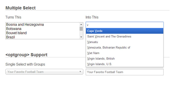
Chosen is a jQuery plugin that makes long, unwieldy select boxes much more user-friendly.
- jQuery support: 1.4+
- Prototype support: 1.7+
Source: harvesthq.github.io
1. INCLUDE CSS AND JS FILES
<link rel="stylesheet" href="chosen.css">
<script src="https://ajax.googleapis.com/ajax/libs/jquery/1.6.4/jquery.min.js" type="text/javascript"></script>
<script src="chosen.jquery.js" type="text/javascript"></script>
2. HTML
<select data-placeholder="Choose a Country..." class="chosen-select">
            <option value=""></option>
            <option value="United States">United States</option>
            <option value="United Kingdom">United Kingdom</option>
            <option value="Afghanistan">Afghanistan</option>
            <option value="Aland Islands">Aland Islands</option>
            <option value="Albania">Albania</option>
            <option value="Algeria">Algeria</option>
            <option value="American Samoa">American Samoa</option>
            <option value="Andorra">Andorra</option>
            <option value="Angola">Angola</option>
            <option value="Anguilla">Anguilla</option>
            <option value="Antarctica">Antarctica</option>
            <option value="Antigua and Barbuda">Antigua and Barbuda</option>
</select>
3. JAVASCRIPT
$(".chosen-select").chosen();
4. OPTIONS
The following options are available to pass into Chosen on instantiation.
Example:
  $(".my_select_box").chosen({
    disable_search_threshold: 10,
    no_results_text: "Oops, nothing found!",
    width: "95%"
  });
| Option | Default | Description |
|---|---|---|
| allow_single_deselect | false | When set to true on a single select, Chosen adds a UI element which selects the first element (if it is blank). |
| disable_search | false | When set to true, Chosen will not display the search field (single selects only). |
| disable_search_threshold | 0 | Hide the search input on single selects if there are fewer than (n) options. |
| enable_split_word_search | true | By default, searching will match on any word within an option tag. Set this option to false if you want to only match on the entire text of an option tag. |
| inherit_select_classes | false | When set to true, Chosen will grab any classes on the original select field and add them to Chosen’s container div. |
| max_selected_options | Infinity | Limits how many options the user can select. When the limit is reached, the chosen:maxselected event is triggered. |
| no_results_text | "No results match" | The text to be displayed when no matching results are found. The current search is shown at the end of the text (e.g., No results match "Bad Search"). |
| placeholder_text_multiple | "Select Some Options" | The text to be displayed as a placeholder when no options are selected for a multiple select. |
| placeholder_text_single | "Select an Option" | The text to be displayed as a placeholder when no options are selected for a single select. |
| search_contains | false | By default, Chosen’s search matches starting at the beginning of a word. Setting this option to trueallows matches starting from anywhere within a word. This is especially useful for options that include a lot of special characters or phrases in ()s and []s. |
| single_backstroke_delete | true | By default, pressing delete/backspace on multiple selects will remove a selected choice. When false, pressing delete/backspace will highlight the last choice, and a second press deselects it. |
| width | Original select width. | The width of the Chosen select box. By default, Chosen attempts to match the width of the select box you are replacing. If your select is hidden when Chosen is instantiated, you must specify a width or the select will show up with a width of 0. |
| display_disabled_options | true | By default, Chosen includes disabled options in search results with a special styling. Setting this option to false will hide disabled results and exclude them from searches. |
| display_selected_options | true |
By default, Chosen includes selected options in search results with a special styling. Setting this option to false will hide selected results and exclude them from searches. Note: this is for multiple selects only. In single selects, the selected result will always be displayed. |
5. ATTRIBUTES AND CLASS
Certain attributes placed on the select tag or its options can be used to configure Chosen.
Example:
  <select class="my_select_box" data-placeholder="Select Your Options">
    <option value="1">Option 1</option>
    <option value="2" selected>Option 2</option>
    <option value="3" disabled>Option 3</option>
  </select>
| Attribute | Description |
|---|---|
| data-placeholder |
The text to be displayed as a placeholder when no options are selected for a select. Defaults to "Select an Option" for single selects or "Select Some Options" for multiple selects. Note:This attribute overrides anything set in the placeholder_text_multiple orplaceholder_text_single options. |
| multiple | The attribute multiple on your select box dictates whether Chosen will render a multiple or single select. |
| selected, disabled | Chosen automatically highlights selected options and disables disabled options. |
Classes placed on the select tag can be used to configure Chosen.
Example:
  <select class="my_select_box chosen-rtl">
    <option value="1">Option 1</option>
    <option value="2">Option 2</option>
    <option value="3">Option 3</option>
  </select>
| Classname | Description |
|---|---|
| chosen-rtl |
Chosen supports right-to-left text in select boxes. Add the class chosen-rtl to your select tag to support right-to-left text options. Note: The chosen-rtl class will pass through to the Chosen select even when theinherit_select_classes option is set to false. |
6. EVENTS
Triggered Events
Chosen triggers a number of standard and custom events on the original select field.
Example:
  $('.my_select_box').on('change', function(evt, params) {
    do_something(evt, params);
  });
| Event | Description |
|---|---|
| change |
Chosen triggers the standard DOM event whenever a selection is made (it also sends a selected or deselected parameter that tells you which option was changed). Note: in order to use change in the Prototype version, you have to include the Event.simulate class. The selected and deselected parameters are not available for Prototype. |
| chosen:ready | Triggered after Chosen has been fully instantiated. |
| chosen:maxselected | Triggered if max_selected_options is set and that total is broken. |
| chosen:showing_dropdown | Triggered when Chosen’s dropdown is opened. |
| chosen:hiding_dropdown | Triggered when Chosen’s dropdown is closed. |
| chosen:no_results | Triggered when a search returns no matching results. |
Note: all custom Chosen events (those that being with chosen:) also include the chosen object as a parameter.
Triggerable Events
You can trigger several events on the original select field to invoke a behavior in Chosen.
Example:
  // tell Chosen that a select has changed
  $('.my_select_box').trigger('chosen:updated');
| Event | Description |
|---|---|
| chosen:updated | This event should be triggered whenever Chosen’s underlying select element changes (such as a change in selected options). |
| chosen:activate | This is the equivalant of focusing a standard HTML select field. When activated, Chosen will capure keypress events as if you had clicked the field directly. |
| chosen:open | This event activates Chosen and also displays the search results. |
| chosen:close | This event deactivates Chosen and hides the search results. |
7. EXAMPLES
Hide Search on Single Select
The disable_search_threshold option can be specified to hide the search input on single selects if there are fewer than (n) options.
$(".chosen-select").chosen({disable_search_threshold: 10});
Default Text Support
Chosen automatically sets the default field text ("Choose a country...") by reading the select element's data-placeholder value. If no data-placeholder value is present, it will default to "Select an Option" or "Select Some Options" depending on whether the select is single or multiple. You can change these elements in the plugin js file as you see fit.
<select data-placeholder="Choose a country..." style="width:350px;" multiple class="chosen-select">
Note: on single selects, the first element is assumed to be selected by the browser. To take advantage of the default text support, you will need to include a blank option as the first element of your select list.
No Results Text Support
Setting the "No results" search text is as easy as passing an option when you create Chosen:
$(".chosen-select").chosen({no_results_text: "Oops, nothing found!"});
Limit Selected Options in Multiselect
You can easily limit how many options the user can select:
$(".chosen-select").chosen({max_selected_options: 5});
If you try to select another option with limit reached chosen:maxselected event is triggered:
$(".chosen-select").bind("chosen:maxselected", function () { ... });
Allow Deselect on Single Selects
When a single select box isn't a required field, you can set allow_single_deselect: true and Chosen will add a UI element for option deselection. This will only work if the first option has blank text.
Right to Left Support
Chosen supports right to left select boxes too. just add "chosen-rtl" in addition to "chosen-select" to your select tags and you are good to go.
<select class="chosen-select chosen-rtl">
Change / Update Events
Form Field Change
-
When working with form fields, you often want to perform some behavior after a value has been selected or deselected. Whenever a user selects a field in Chosen, it triggers a "change" event* on the original form field. That let's you do something like this:
$("#form_field").chosen().change( … );
Updating Chosen Dynamically
-
If you need to update the options in your select field and want Chosen to pick up the changes, you'll need to trigger the "chosen:updated" event on the field. Chosen will re-build itself based on the updated content.
$("#form_field").trigger("chosen:updated");
Custom Width Support
Using a custom width with Chosen is as easy as passing an option when you create Chosen:
$(".chosen-select").chosen({width: "95%"});
 JS Tutorial


