Download
User Rating: 0/5 ( 0 votes)
Breakpoints.js is a jQuery plugin that makes modular responsive design possible by adding classes to elements based on defined breakpoints.
Why?
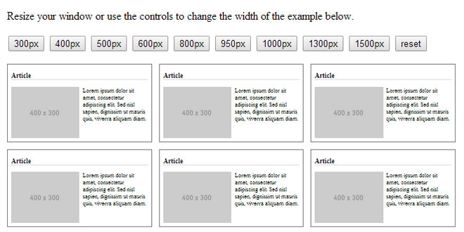
Let's say I have a block in a responsive design. I have three versions of the block: "small", "medium", and "large". Imagine this block in a single column layout. It starts off at "medium", then stretches to "large", until eventually another column is introduced, and it goes to "small" because the column it is in is made smaller in order to fit the newly added column. This same sort of thing happens as each additional column is introduced and the columns stretch. Until a better term comes along, we can call this "modular responsive design".
But with media queries, this is not easy to do. You end up copying rules across breakpoints in order to reproduce the layout of the block. Media queries are only concerned with the width of the screen, whereas the layout of the block is determined by the width of the block itself. It would be much easier to accomplish this if breakpoints were defined on individual blocks rather than on the screen.
Enter breakpoints.js, a jQuery plugin that makes modular responsive design possible by adding classes to elements based on defined breakpoints. And voila! You have modular responsive design.
Source: reusables.io
1. INCLUDE JS FILES
<script src="jquery-1.11.1.min.js"></script>
<script src="../breakpoints.js"></script>
2. HTML
<article class="small">
  <h1>Small Article</h1>
  <img src="http://placehold.it/400x300" />
  <p>Lorem ipsum dolor sit amet, consectetur adipiscing elit. Sed nisl sapien, dignissim ut mauris quis, viverra aliquam diam.</p>
</article>

<article class="medium">
  <h1>Medium Article</h1>
  <img src="http://placehold.it/400x300" />
  <p>Lorem ipsum dolor sit amet, consectetur adipiscing elit. Sed nisl sapien, dignissim ut mauris quis, viverra aliquam diam.</p>
</article>

<article class="large">
  <h1>Large Article</h1>
  <img src="http://placehold.it/400x300" />
  <p>Lorem ipsum dolor sit amet, consectetur adipiscing elit. Sed nisl sapien, dignissim ut mauris quis, viverra aliquam diam.</p>
</article>
3. JAVASCRIPT
$(function () {
    $.breakpoints({
      'article': {
        'small': [0, 350],
        'medium': [350, 450],
        'large': [450, null]
      }
    });
});
4. API
.breakpoint(name, min, max)
Defines a breakpoint for matched elements.
On document load and window resize, if the element width matches the breakpoint (min <= width < max) the provided name will be added as a class on the element.
Parameters
name
Type: String Class name will be added to element for styling.
min
Type: Number Minimum width for breakpoint. Defaults to 0 if falsy.
max
Type: Number Maximum width for breakpoint. Defaults to Infinity if falsy.
Return
Returns original jQuery elements for method chaining.
Example
$('.slider').breakpoint('small', 0, 320)
  .breakpoint('medium', 320, 480)
  .breakpoint('large', 480, null);
jQuery.breakpoints(config)
Defines a set of breakpoints.
Parameters
config
Type: Object jQuery selector strings as keys, list of breakpoints as values. Breakpoint lists are keyed by breakpoint name. The value of each breakpoint is an array containing the breakpoint min and max.
Example
$.breakpoints({
  '.test': {
    'small': [0, 320],
    'medium': [320, 480],
    'large': [480, null]
  }
});
 JS Tutorial


