- Overview
- Documents
- Demos
Tablesaw is a set of jQuery plugins for responsive tables that easy to create Stack Tables, Swipe Tables, Toggle Tables, and many more.
sex shop sex shop sex shop sex shop sex shop seks shop spanish fly psikolog sohbet numara sohbet hatti
Source: github.com
1. INCLUDE CSS AND JS FILES
<link rel="stylesheet" href="tablesaw.css">
<script src="jquery.js"></script>
<!--[if lt IE 9]><script src="respond.min.js"></script><!--<![endif]-->
<script src="tablesaw.js"></script>
Next include the tablesaw icons in src/icons with your grunticon build and include the grunticon loader.
2. HTML
Stack
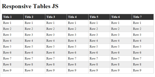
The Stack Table stacks the table headers to a two column layout with headers on the left when the viewport width is less than 40em (640px).
<table class="tablesaw tablesaw-stack" data-mode="stack">
If you only want to use the Stack Table and don’t want all the extra features below (save yourself some bytes), Tablesaw provides a Stack-Only version.
Toggle
The Column Toggle Table allows the user to select which columns they want to be visible.
<table data-mode="columntoggle">
Table headers must have a data-priority attribute to be eligible to toggle. data-priority is a numeric value from 1 to 6, which determine default breakpoints at which a column will show. As of first release, the defaults are:
<th data-priority="persist"><!-- Not eligible for toggle, always shows --></th>
<th data-priority="1"><!-- Shows at (min-width: 20em) (320px) --></th>
<th data-priority="2"><!-- Shows at (min-width: 30em) (480px) --></th>
<th data-priority="3"><!-- Shows at (min-width: 40em) (640px) --></th>
<th data-priority="4"><!-- Shows at (min-width: 50em) (800px) --></th>
<th data-priority="5"><!-- Shows at (min-width: 60em) (960px) --></th>
<th data-priority="6"><!-- Shows at (min-width: 70em) (1120px) --></th>
Add a Mini Map
<table data-mode="columntoggle" data-minimap>
Swipe
Allows the user to use the swipe gesture (or use the left and right buttons) to navigate the columns.
<table data-mode="swipe">
Columns also respect the data-priority="persist" attribute.
<th data-priority="persist"><!-- Always shows --></th>
Add a Mini Map
<table data-mode="swipe" data-minimap>
Mini Map
Use data-minimap to add a series of small dots to show which columns are currently visible and which are hidden. Only available on swipe and columntoggle tables. Examples available above.
Mode Switcher
<table data-mode-switch>

<!-- With a different default mode -->
<table data-mode="swipe" data-mode-switch>

<!-- Exclude a mode from the switcher -->
<table data-mode-switch data-mode-exclude="columntoggle">
Sortable
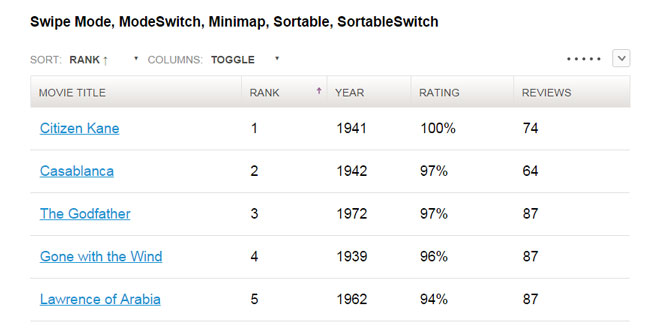
The “sortable” option allows the user to sort the the table data by clicking on the table headers. Since all the columns may not be visible on smaller breakpoints (or not there at all if using the “stack” table mode), relying solely on the column headers to choose the table sort isn’t practical. To address this, there is an optional data-sortable-switch attribute on the table that adds a select menu auto-populated with the names of each column in the table with options for choosing ascending or descending sort direction. Data options on table headers can be used to control which columns are sortable (data-sortable-col) and the default sort order (data-sortable-default-col).
<table data-sortable>
    <thead>
        <tr>
            <!-- Default column -->
            <th data-sortable-col data-sortable-default-col>Rank</th>
            <th data-sortable-col>Movie Title</th>
            <th data-sortable-col>Year</th>
            <th data-sortable-col><abbr title="Rotten Tomato Rating">Rating</abbr></th>
            <!-- Unsortable column -->
            <th>Reviews</th>
        </tr>
    </thead>
    ...
Use data-sortable-switch to add a select form element to manually choose the sort order.
<table data-sortable data-sortable-switch>
Kitchen Table Sink
All of the above options combined into a single table.
 JS Tutorial


