- Overview
- Documents
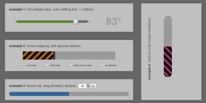
sGlide is a super flexible and light-weight jQuery plugin that generates a simple, feature-rich & mobile ready slider, which can be easily customized and styled using regular CSS.
Source: iframework.net
1. INCLUDE JS FILES
<script type="text/javascript" src="http://code.jquery.com/jquery-2.0.3.min.js"></script>
<script type="text/javascript" src="sGlide-1.10.0.min.js"></script>
2. HTML
<div id="slider1" class="slider_bar"></div>
<div class="pct">70%</div>
3. JAVASCRIPT
$(document).ready(function(){
	$('#slider1').sGlide({
		'width': 85,
		'height': 12,
		'image': 'img/knob.png',
		'startAt': 83,
		'colorStart': '#360',
		'colorEnd': '#693',
		'buttons': true,
		drag: function(o){
			// console.log(o.guid+': '+o.sliderValue+'%');
			$('.pct').html(Math.round(o.value)+'<sup>%<sup>');
		},
		onButton: function(o){
			// console.log(o.guid+': '+o.sliderValue+'%');
			$('.pct').html(Math.round(o.value)+'<sup>%<sup>');
		}
	});
});
Just apply sGlide() to an empty <div> with a unique identifier. You can leverage this identifier (or class) to style the shell and its components with CSS. Hint: use .slider_knob and .follow_bar
You can also create a loadbar by passing a percentage value (use decimal points for added precision) to the startAt prop of an existing slider: $('#my_slider').sGlide('startAt', 68.2); or make animated AJAX gauges: $('#my_slider').sGlide('startAt', 85.9, true) by setting the animated param to true. To rebuild a slider, destroy it first: $('#my_slider').sGlide('destroy').
To enable keyboard arrow controls, give your main shell the following attribute: data-keys="true"
4. OPTIONS
| Property | Default | Description |
| startAt | 0 | Number. Percent value to set the slider handle position on its creation. Inject your data here to visually represent it. |
| image | 'none' | String. Path of handle (a.k.a. "knob") image to use; e.g. 'images/slider-knob.png' |
| width | 100 | Number. The width of the main shell of the slider. If unit is set to '%', width will be relative to its parent. |
| height | 40 | Number. Pixel value of the height of the main shell of the slider. Ignores unit. |
| unit | '%' | String. Also accepts 'px' to govern widths. |
| pill | true | Boolean. Set to false to turn off rounded corners. |
| disabled | false | Boolean. For data display only. Set to true to disable user interactivity. |
| colorStart | '' | String. Standard CSS color value; e.g. '#669933' or 'red'. Used for color shifting, so as the knob slides, the follow bar's color transitions between the color set here and that of colorEnd. |
| colorEnd | '' | String. Standard CSS color value; e.g. '#669933' or 'red'. Used for color shifting, so as the knob slides, the follow bar's color transitions between the color set here and that of colorStart. |
| vertical | false | Boolean. Rotates the slider 90 degrees counterclockwise using CSS3. The −/+ buttons are exempt, so you'll have to position them manually. When true, refrain from positioning the slider and its parent elements absolutely or relatively as this will offset the cursor registration. |
| showKnob | true | Boolean. Hides the knob when false. |
| buttons | false | Boolean. Draws −/+ buttons that flank the slider. You can use the onload callback to change the HTML content of the buttons once they've been drawn. Style them as necessary. Clicking one of the buttons will advance the slider 10%. Click & hold to advance continuously. When hard or onlyOnDrop snapping is enabled, the slider will advance to the snap points. (The [enabled] keyboard controls work on the same principle, although independently.) |
| snap | {…} | Object. Contains the following snap settings. |
| snap.points | 0 | Number. Set the number of snap points between 1 and 9. Effectively enables snapping. |
| snap.markers | false | Boolean. When true, draws tiny snap markers to indicate the snap points. CSS to change the color:#sliderid_markers div { border-left: #999 solid 1px !important; }. |
| snap.hard | false | Boolean. Meaning the slider handle cannot be positioned between snap points. |
| snap.onlyOnDrop | false | Boolean. Same as hard, but only after the handle has been dropped. Overrides hard. |
| drop | Callback. Fire an event on handle drop. Returns an object containing slider data. | |
| drag | Callback. Fire an event on handle drag. Returns an object containing slider data. | |
| onSnap | Callback. Fire an event on handle snap. Returns an object containing slider data. | |
| onButton | Callback. Fire an event clicking or holding one of the −/+ buttons. Returns an object containing slider data. | |
| onload | Callback. Fire an event when the slider has finished loading. Returns nothing. |
 JS Tutorial


