Download
User Rating: 2.9/5 ( 3 votes)
Salvattore is a library agnostic JS script that will help you organize your HTML elements according to the number of columns you specify, like jQuery Masonry.
Features
-
No requirements: Salvattore is a standalone script, it will work right away after being referenced in your HTML page.
-
Extremely lightweight: about 2.5KB (minified and gzipped.)
-
CSS-driven configuration: the number of columns is defined in CSS and the styling is left to the user.
-
Media queries ready: the same parameters can be used inside media queries for better results on different devices.
-
Wide browser support: modern browsers and IE9+ (though we're working on IE8.)
HOW IT WORKS
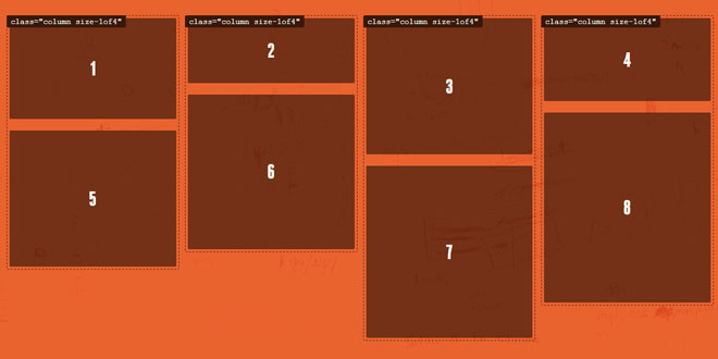
Salvattore distributes your grid items according to the number of columns you specify. Each of the items in your grid is placed within these columns, one by one. To get started, simply add the data-columns attribute to the grid element.
<div id="grid" data-columns>
	<div>Item #1</div>
	<div>Item #2</div>
	<div>Item #3</div>
	…
	<div>Item #20</div>
</div>
Now, in your CSS file, simply refer to the grid, followed by the ::before pseudo-element. The number of columns desired and the class or classes for each of them should be defined on the content property.
#grid[data-columns]::before {
	content: '3 .column.size-1of3';
}

/* These are the classes that are going to be applied: */
.column { float: left; }
.size-1of3 { width: 33.333%; }
With those settings, Salvattore is ready to go! And the resulting HTML should be the following:
<div id="grid" data-columns>
	<div class="column size-1of3">
		<div>Item #1</div>
		<div>Item #4</div>
		…
	</div>
	<div class="column size-1of3">
		<div>Item #2</div>
		<div>Item #5</div>
		…
	</div>
	<div class="column size-1of3">
		<div>Item #3</div>
		<div>Item #6</div>
		…
	</div>
</div>
If you didn't provide any classes in your CSS settings, .column will be used by default.
MEDIA QUERIES
Making your design responsive is just as easy as you would think. You only need to wrap your Salvattore settings in your @media rule.
@media screen and (max-width: 480px){
	#grid[data-columns]::before {
		content: '1 .column.size-1of1';
	}
}

@media screen and (min-width: 481px) and (max-width: 768px) {
	#grid[data-columns]::before {
		content: '2 .column.size-1of2';
	}
}
@media screen and (min-width: 769px) {
	#grid[data-columns]::before {
		content: '3 .column.size-1of3';
	}
}

/* Again, you’re free to use and define the classes: */
.column { float: left; }
.size-1of1 { width: 100%; }
.size-1of2 { width: 50%; }
.size-1of3 { width: 33.333%; }
This whole website is responsive, so you can see how well this works by resizing your viewport. Also, please make sure you set the min-width and max-width very detailed like above so that the script runs properly.
Note: media queries compatibility only works on a server (local or remote). And unfortunately, it won’t play well with other at-rules, such as@charset or @import.
DYNAMIC CONTENT
Salvattore has two functions you can work with: append_elements and prepend_elements. These two functions have the same arguments: the grid and the elements you want added to it.
var grid = document.querySelector('#grid');
var item = document.createElement('article');

salvattore['append_elements'](grid, [item])
item.outerHTML = 'I’ve been appended!';
 JS Tutorial


