- Overview
- Documents
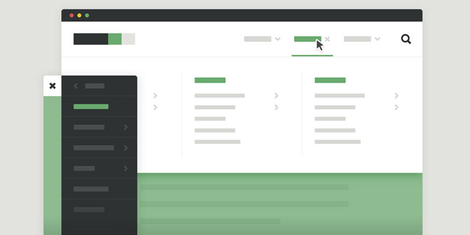
Mega-Site Navigation is a responsive and easy to customize navigation for mega-sites, enriched by subtle CSS animations and support for devices with javascript disabled.
-
sex shop
sex shop
sex shop
sex shop
sex shop
seks shop
spanish fly
psikolog
sohbet numara
sohbet hatti
Source: codyhouse.co
1. HTML
The HTML structure of a complex navigation is generally composed by nested unordered lists. This one makes no exception. We created 4 main sections: <header>, <main>,<nav> and .cd-search <div>. You may be wondering why the navigation is not wrapped into the <header> element: we do move it inside for bigger devices (viewport width >=1170px) using jQuery. On smaller devices it was way easier to handle the navigation as a separate element.
<header class="cd-main-header">
    <a class="cd-logo" href="#0"><img src="img/cd-logo.svg" alt="Logo"></a>

    <ul class="cd-header-buttons">
        <li><a class="cd-search-trigger" href="#cd-search">Search<span></span></a></li>
        <li><a class="cd-nav-trigger" href="#cd-primary-nav">Menu<span></span></a></li>
    </ul> <!-- cd-header-buttons -->
</header>

<main class="cd-main-content">
    <!-- your content here -->

    <div class="cd-overlay"></div>
</main>

<nav class="cd-nav">
    <ul id="cd-primary-nav" class="cd-primary-nav is-fixed">
        <li class="has-children">
            <a href="#0">Clothing</a>

            <ul class="cd-secondary-nav is-hidden">
                <li class="go-back"><a href="#0">Menu</a></li>
                <li class="see-all"><a href="#0">All Clothing</a></li>
                <li class="has-children">
                    <a href="#0">Accessories</a>

                    <ul class="is-hidden">
                        <li class="go-back"><a href="#0">Clothing</a></li>
                        <li class="see-all"><a href="#0">All Accessories</a></li>
                        <li class="has-children">
                            <a href="#0">Beanies</a>

                            <ul class="is-hidden">
                                <li class="go-back"><a href="#0">Accessories</a></li>
                                <li class="see-all"><a href="#0">All Benies</a></li>
                                <li><a href="#0">Caps</a></li>
                                <li><a href="#0">Gifts</a></li>
                                <li><a href="#0">Scarves</a></li>
                            </ul>
                        </li>
                        <li><!-- ... --></li>
                    </ul>
                </li>

                <li><!-- ... --></li>
                <li><!-- ... --></li>
                <li><!-- ... --></li>
            </ul>
        </li>

        <li class="has-children">
            <!-- ... -->
        </li>

        <li class="has-children">
            <!-- ... -->
        </li>

        <li><a href="#0">Standard</a></li>
    </ul> <!-- primary-nav -->
</nav> <!-- cd-nav -->

<div id="cd-search" class="cd-search">
    <form>
        <input type="search" placeholder="Search...">
    </form>
</div>
2. CSS
The CSS is pretty simple, although the amount of code required for this nugget is higher compared to our average resource. You can download the source file and check how we achieved some nice animations from there.
One important thing: I created 2 classes that can be used to change a bit the navigation behaviour. Note that both classes must be applied to the <body> element:
- nav-is-fixed – if you want a fixed navigation
- nav-on-left – if you want the navigation on the left side on mobile devices
I don’t know if you folks use pre-processors for CSS or not (We use SASS for all our resources). If you don’t, I’d really encourage you to give it a try. As an incentive, check how easy it would be to change some of the navigation settings with SASS (yep, you can set variables!):
// colors

$color-1: #2e3233; // grey dark
$color-2: #69aa6f; // green
$color-3: #e2e3df; // grey light
$color-4: #ffffff; // white

// fonts

$primary-font: sans-serif;

// header size

$header-height-S: 50px;
$header-height-L: 80px;

// Navigation size

$nav-width-S: 260px;

// Search size

$search-height-S: 50px;
$search-height-L: 120px;

// z-index

$below-content: 1;
$content: 2;
$above-content: 3;
3. EVENTS HANDING
We didn’t do a lot in jQuery, apart from adding classes according to specific events. The only important thing to note is that in the starting HTML structure the navigation is outside the <header>. Since we created this resource starting from mobile, we wanted the navigation to be on the side, hidden by default, and it was easier for us to have it outside the header.
On desktop devices (viewport width more than 1170px), we use jQuery to move the navigation inside the header.
 JS Tutorial


