Download
User Rating: 3/5 ( 1 votes)
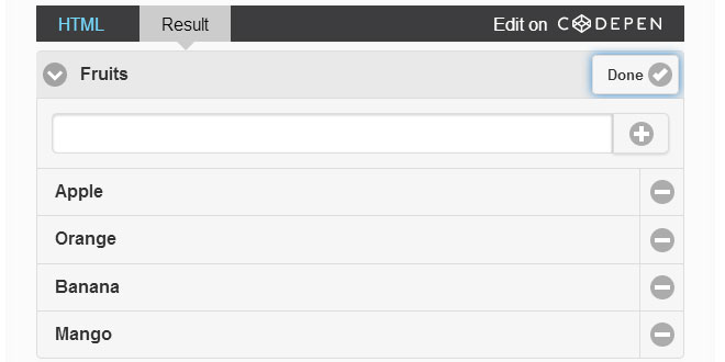
Editable Listview is a jQuery Mobile Plugin with an intuitive UI to add new list items and remove existing ones.

Why
Many a times, you come across a situation where you want to allow editing of list items. To do this simple task, you have to build extra functionality around the Listview widget to allow for insertion of new list items and removal of existing list items. Editable Listview plugin is designed to take the pain out of this situaiton by having all this functionality baked-in.
Features
-
Allows insertion of new list items right in the Listview.
-
Allows easy removal of existing list items.
Source: baig.github.io
1. INCLUDE CSS AND JS FILES
<link rel="stylesheet" href="http://ajax.googleapis.com/ajax/libs/jquerymobile/1.4.2/jquery.mobile.css" />
<link rel="stylesheet" href="../css/editable-listview.css">
<script src="http://code.jquery.com/jquery-2.1.1.js"></script>
<script src="http://ajax.googleapis.com/ajax/libs/jquerymobile/1.4.2/jquery.mobile.js"></script>
<script src="../js/editable-listview.js"></script>
2. HTML
<ul data-title="Demo">
  <li>Running</li>
  <li>Cycling</li>
  <li>Surfing</li>
  <li>Jogging</li>
</ul>
3. JAVASCRIPT
$( "ul" ).listview({
  editable: true,
  editableType: "simple",
  title: "Activities",
  emptyTitle: "No Activities",
  buttonTheme: "b",
  buttonShadow: false,
  buttonCorner: false,
});
4. ATTRIBUTES
-
data-editable - A Boolean value indicating whether to initialize the listview as editable or not. Default value is true.
-
data-title - A String used as the title of the list when the list contains at least one item. Default value is "View list items".
-
data-empty-title - A String used as the title of the list when the list is empty. Default value is "No items to view".
-
data-add-label - A String used as the label of the button when the list is empty. Default value is "Add".
-
data-add-icon - Icon of the button when the list is empty. Default value is "plus".
-
data-edit-label - Label of the Edit button. Default value is "Edit".
-
data-edit-icon - Icon of the button when the list is not empty. Default value is "edit".
-
data-done-label - Label of the button when the list is in edit mode. Default value is"Done".
-
data-done-icon - Icon of the button when the list is in edit mode empty. Default value is "check".
-
data-collapsed - A boolean value indicating whether the list will be collapsed or not when initialized. Default is value "true".
-
data-collapsed-icon - Icon next to list title when the list is collapsed. Default value is "carat-r".
-
data-expanded-icon - Icon next to list title when the list is expanded. Default value is "carat-d".
-
data-enhanced - (Not implemented yet!) A boolean value indicating whether the DOM has already been enhanced or not. If so, then all the required DOM structure along with relevant CSS classes and corresponding data attributes must be present. Default value is "false".
5. OPTIONS
editable: false,
editableType: 'simple',
editableForm: '',

title: "View list items",
emptyTitle: "No items to view",
editLabel: "Edit",
addLabel: "Add",
doneLabel: "Done",
addIcon: "plus",
editIcon: "edit",
doneIcon: "check",

buttonTheme: 'a',
buttonCorner: true,
buttonShadow: true,

itemIcon: false,

collapsed: false,
expandedIcon: 'carat-d',
collapsedIcon: 'carat-r'
 JS Tutorial


