1. INCLUDE CSS AND JS FILES
<link href="http://netdna.bootstrapcdn.com/bootstrap/3.1.0/css/bootstrap.min.css" rel="stylesheet">
<link href="path/to/css/fileinput.min.css" media="all" rel="stylesheet" type="text/css" />
<script src="//ajax.googleapis.com/ajax/libs/jquery/1.11.0/jquery.min.js"></script>
<script src="path/to/js/fileinput.min.js" type="text/javascript"></script>
2. HTML
<input id="input-id" type="file" class="file" data-preview-file-type="text">
3. JAVASCRIPT
$("#input-id").fileinput({'showUpload':false, 'previewFileType':'any'});
4. OPTIONS
The plugin supports these following options:
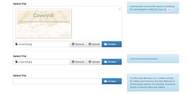
showCaption: boolean whether to display the file caption. Defaults to true.
showPreview: boolean whether to display the file preview. Defaults to true.
showRemove: boolean whether to display the file remove/clear button. Defaults to true.
showUpload: boolean whether to display the file upload button. Defaults to true. This will default to a form submit button, unless the uploadUrl is specified.
captionClass: string any additional CSS class to append to the caption container.
previewClass: string any additional CSS class to append to the preview container.
mainClass: string any additional CSS class to append to the main plugin container.
mainTemplate: string the template used to render the widget. The following template variables will be parsed:
-
{class}: any additional CSS class to append to the main widget container.
-
{preview}: the content parsed by the previewTemplate and will be displayed only if showPreview istrue.
-
{caption}: the content parsed by the captionTemplate and will be displayed only if showCaption istrue.
-
{remove}: the file remove/clear button and will be displayed only if showRemove is true.
-
{upload}: the file upload button and will be displayed only if showUpload is true.
-
{browse}: the main file browse button to select your files for input.
The mainTemplate if not passed, will be automatically set based on showCaption settings.
-
If showCaption is set to true, the mainTemplate will default to:
{preview}
<div class="input-group {class}">
   {caption}
   <div class="input-group-btn">
       {remove}
       {upload}
       {browse}
   </div>
</div>
-
If showCaption is set to false, the mainTemplate will default to:
{preview}\n{remove}\n{upload}\n{browse}\n
initialPreview: string | array the initial preview content to be displayed. You can pass the minimal HTML markup for displaying your image, text, or file. If set as a string, this will display a single file in the initial preview. If set as an array, it will display all files in the array as an initial preview (useful for multiple file upload scenarios).
The following CSS classes will need to be added for displaying each file type as per the plugin style theme:
-
image files: Include CSS class file-preview-image
-
text files: Include CSS class file-preview-text
-
other files: Include CSS class file-preview-other
Examples of how you can setup various files for initial preview:
// for image files
initialPreview: [
    "<img src='/images/desert.jpg' class='file-preview-image' alt='Desert' title='Desert'>",
    "<img src='/images/jellyfish.jpg' class='file-preview-image' alt='Jelly Fish' title='Jelly Fish'>",
],

// for text files
initialPreview: "<div class='file-preview-text' title='NOTES.txt'>" +
    "This is the sample text file content upto wrapTextLength of 250 characters" +
    "<span class='wrap-indicator' onclick='$(\"#show-detailed-text\").modal(\"show\")' title='NOTES.txt'>[…]</span>" +
    "</div>"

// for other files
initialPreview: "<div class='file-preview-text'>" +
    "<h2><i class='glyphicon glyphicon-file'></i></h2>" +
    "Filename.xlsx" + "</div>"
initialCaption: string the initial preview caption text to be displayed. If you do not set a value here and initialPreview is set to true this will default to "{preview-file-count} files selected", where {preview-file-count} is the count of the files passed in initialPreview.
captionTemplate: string the template used to render the caption. The following template variables will be parsed:
-
{class}: any additional CSS class to append to the caption container.
The captionTemplate if not set will default to:
<div class="form-control file-caption {class}">
   <span class="glyphicon glyphicon-file"></span> <span class="file-caption-name"></span>
</div>
previewTemplate: string the template used to render the preview. The following template variables will be parsed:
-
{class}: any additional CSS class to append to the preview container.
The previewTemplate if not set will default to:
<div class="file-preview {class}">
<div class="file-preview-status text-center text-success"></div>
<div class="close fileinput-remove text-right">×</div>
<div class="file-preview-thumbnails"></div>
<div class="clearfix"></div> +
</div>
browseLabel: string the label to display for the file picker/browse button. Defaults to Browse ….
browseIcon: string the icon to display before the label for the file picker/browse button. Defaults to <i class="glyphicon glyphicon-folder-open"></i> .
browseClass: string the CSS class for the file picker/browse button. Defaults to btn btn-primary.
removeLabel: string the label to display for the file remove button. Defaults to Remove.
removeIcon: string the icon to display before the label for the file picker/remove button. Defaults to <i class="glyphicon glyphicon-ban-circle"></i> .
removeClass: string the CSS class for the file remove button. Defaults to btn btn-default.
uploadLabel: string the label to display for the file upload button. Defaults to Upload.
uploadIcon: string the icon to display before the label for the file upload button. Defaults to <i class="glyphicon glyphicon-upload"></i> .
uploadClass: string the CSS class for the file upload button. Defaults to btn btn-default.
uploadUrl: string the URL for the upload processing action (typically for ajax based processing). Defaults to null. If this is not set or null, then the upload button action will default to form submission.
msgLoading: string the message displayed when the files are getting read and loaded for preview. Defaults to Loading ….
msgProgress: string the progress message displayed as each file is loaded for preview. Defaults to Loaded {percent}% of {file}. The following variables will be replaced:
-
{percent}: the percentage of file read and loaded.
-
{file}: the name of the file being loaded.
msgSelected: string the progress message displayed in caption window when multiple (more than one) files are selected. Defaults to {n} files selected. The following variables will be replaced:
-
{n}: the number of files selected.
previewFileType: string the type of files that are to be displayed in the preview window. Defaults to image. Can be one of the following:
-
image: Only image type files will be shown in preview.
-
text: Only text type files will be shown in preview.
-
any: Both image and text files content will be shown in preview.
Files other than image or text will be displayed as a thumbnail with the filename in the preview window.
wrapTextLength: integer the number of characters after which the content will be stripped/wrapped for text preview. Defaults to 250.
wrapIndicator: string the type of files that are to be displayed in the preview window. Defaults to <span class="wrap-indicator" title="{title}">[…]</span>. The following variables will be replaced:
-
{title}: the content of the entire text file that will be displayed as a span title element.
elCaptionContainer: string the identifier for the container element containing the caption (e.g. '#id'). If not set, will default to the container with CSS class file-caption inside the main plugin container.
elCaptionText: string the identifier for the container element containing the caption text (e.g. '#id'). If not set, will default to the container with CSS class file-caption-name inside the main plugin container.
elPreviewContainer: string the identifier for the container element containing the preview (e.g. '#id'). If not set, will default to the container with CSS class file-preview inside the main plugin container.
elPreviewImage: string the identifier for the element containing the preview image thumbnails (e.g. '#id'). If not set, will default to the container with CSS class file-preview-thumbnails inside the main plugin container.
elPreviewStatus: string the identifier for the element containing the preview progress status (e.g. '#id'). If not set, will default to the container with CSS class file-preview-status inside the main plugin container.
5. EVENTS
The plugin supports these events:
fileclear: This event is triggered when the file input is cleared with the remove button.
Example:
$('#input-id').on('fileclear', function(event) {
    console.log("fileclear");
});
filereset: This event is triggered when the file input is reset to initial value.
Example:
$('#input-id').on('filereset', function(event) {
    console.log("filereset");
});
6. METHODS
The plugin supports these methods:
reset: Reset the file input.
$('#input-id').fileinput('reset');
clear: Clear the file input.
$('#input-id').fileinput('clear');
refresh: Refreshes the file input plugin based on options provided. You can supply an array of plugin options as a parameter.
// example 1 (disable at runtime)
$('#input-id').attr('disabled', 'disabled');
$('#input-id').fileinput('refresh');

// example 2 (modify plugin options at runtime)
$('#input-id').fileinput('refresh', {browseLabel: 'Select...', removeLabel: 'Delete'});
 JS Tutorial


